
SkillShare

New Features
1-on-1 office hour
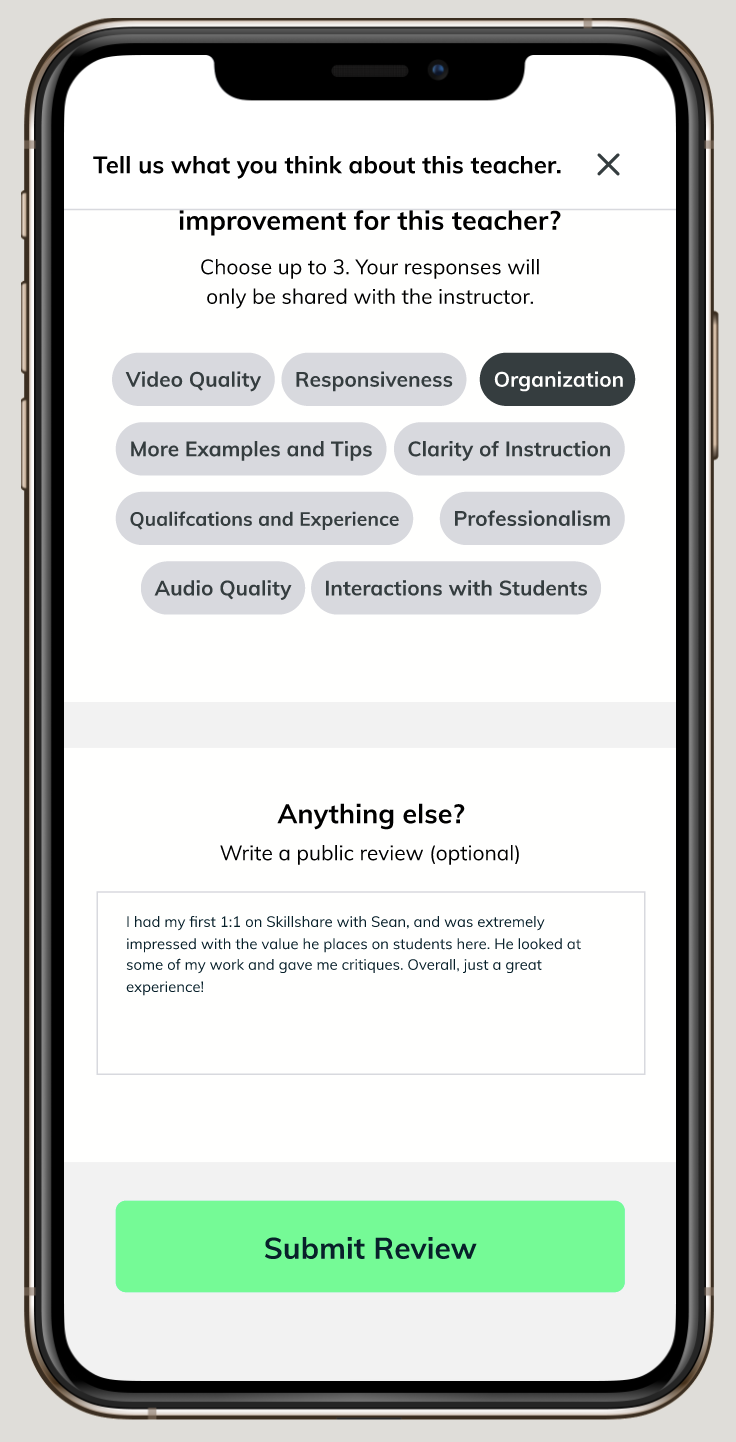
Teacher’s experience, ratings, and comments
OVERVIEW
PROBLEM
SkillShare is the largest creative learning platform for entrepreneurs and creative professionals. Currently, their registered users reach 12 million and further distinguished themselves from their competitors beyond the web. Last year, daily views and time spent on SkillShare tripled during the 2020 pandemic. With the rise of competitors in the market with advanced features such as tutoring and teacher ratings that allow students to build trust and confidence, SkillShare wants to further improve their app to meet the needs of their users, retain current users, and gain new users.
MY ROLE
This was a group concept project where I followed the double diamond approach. My partner and I worked alongside each other throughout the project. I took part in UX Research, UX Design, and Hi-Fidelity UI.
DURATION
2 weeks
SOLUTION
A clickable high fidelity prototype in Figma including onboarding, homepage, teacher profile, teacher’s ratings, 1-on-1 office hours, and confirmation page. The solution allows for:
Booking 1-on-1 office hour sessions with teachers that are tailored to user’s needs such as asking for advice, getting feedback on work, and learning in a more personalized way, which replicates the in-class and hands-on experience.
Users can stack their schedules with great classes from teachers they can trust by checking out a teacher’s experience, ratings, comments, and classes.
THE CHALLENGE
CLIENT
Skillshare is a learning platform with thousands of prerecorded online classes taught by professionals around the world. In January 2020, SkillShare relaunch to focus more on creative classes. Founded by Malcolm Ong and Michael Karnjanaprakorn in New York City: Nov. 2010, SkillShare is driven by the mission to inspiring discovery through creativity. From Workshops: Classes structured over multiple weeks, to Teach Challenge: a weekly program for teachers and now Live sessions, SkillShare constantly finds ways to improve to meet their user’s needs.
BUSINESS GOALS
Skillshare believes in the seemingly simple act of creating can be a force for growth, change, and discovery in people’s lives. They want to inspire and multiply the kind of creative exploration that further exploration that furthers expression, learning, and applications. Skillshare hopes to be the platform for members to come together to find inspiration and take the next step in their creative journey.
THE OPPORTUNITY
Book 1-on-1 office hour sessions with selected teachers
Choose teachers based on profile, ratings, and review
Submit ratings and reviews for teachers and classes
THE PROCESS
1 2 3 4
Discover DEFINE IDEATE DELIVER
User Screening Persona Feature Prioritization Style Guide
User Interview Empathy Map User Flow Final Designs
Affinity Mapping User Journey Map Sketches Next Steps
C & C Analysis Problem Statement Usability Testing
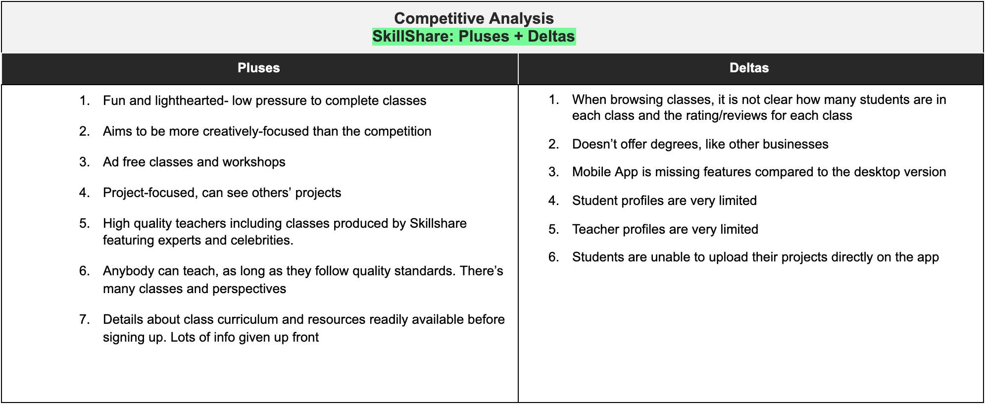
Pluses + Deltas Site Maps
Inventory Analysis
Heuristic Analysis
DISCOVER
user interviews
For the interviews, we split the initial tasks. I worked on the interview script, whilst my teammates worked on the Survey.
We surveyed 30 participants and interviewed 6 people. Our key findings summarized with users needs and challenges:
I want to ensure that my instructor is qualified and able to receive their feedback
I want to only spend time on high-quality content

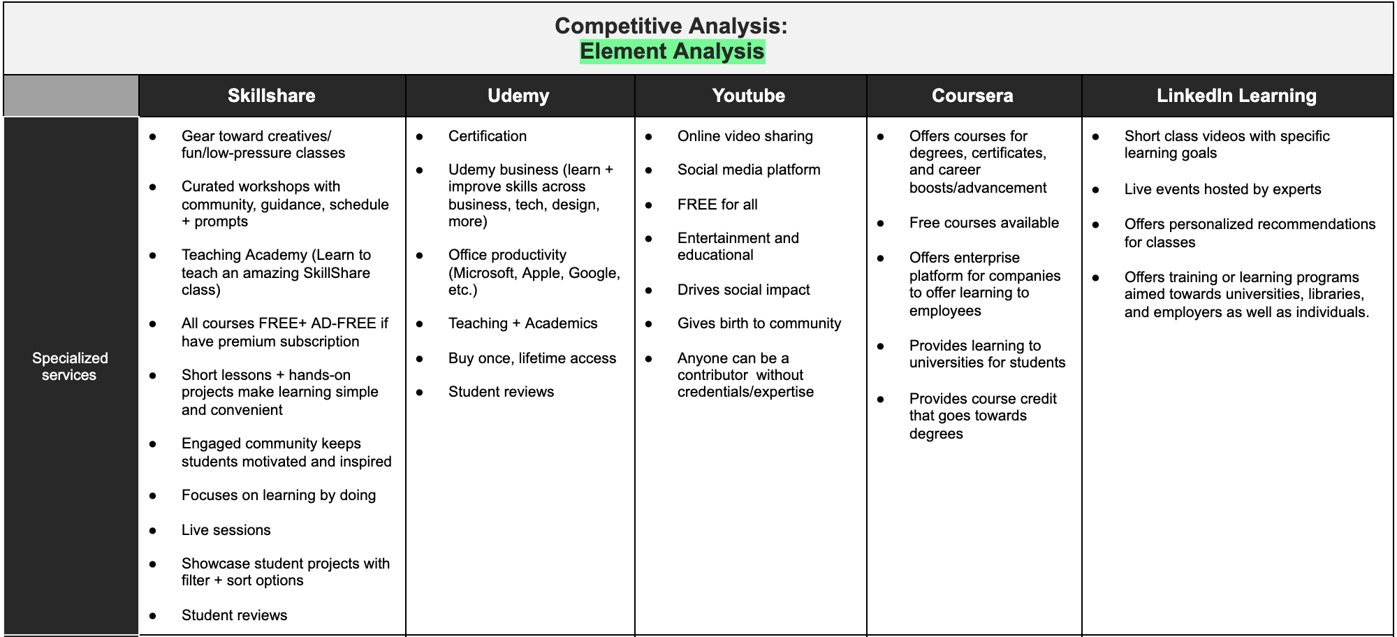
COMPARATIVE AND COMPETITIVE ANALYSIS
We conducted an analysis of Skillshare’s existing competitors in online learning platforms, and also their future competitors on features such as 1-on-1 sessions and teacher ratings.
Our competitor analysis highlighted the following:
There was a clear lacking the 1-on-1 session with students’ focus. None of Skillshare’s direct competitors were offering this.
Teachers profile, ratings, and reviews are limited

HEURISTIC EVALUATION
After carefully analyzing the app using the Heuristic Evaluation’s checklist system, we found several gaps we can fill when it comes to comparing the app to the desktop:
Visibility of System Status
Recognition Rather Than Recall
Help and Documentation
Skills
Privacy
HYPOTHESIS
Our hypothesis is that there is an opportunity to fill this gap. We wanted to ensure our designs emphasize the 1-on-1 focus for users and the ability to see teacher’s profiles and provide ratings and reviews. This also came up in our interview findings, where users desiring connection and guidance beyond the classroom and are worrying if their classes and teachers are validated.
DEFINE
PERSONA
From our research we created our Persona, Stephanie:

Stephanie's PROBLEM STATEMENTS
Skillshare app users need a way to learn more about their instructors and connect with them beyond the classroom in order to feel like they are receiving the best quality instruction.
how might we’s
How might we let students see that their teacher or instructor is qualified?
How might we allow students to receive feedback about their work?
How might we ensure that students can find the best quality classes?
How might we encourage students to interact directly with their instructors?
How might we make users feel like their time spent on Skillshare is worthwhile?
OUR HYPOTHESIS
We believe that by offering a 1-on-1 session with students’ focus and teacher ratings, we can provide Stephanie with a tailored approach to her specific needs.
IDEATE
START WITH ROUGH SKETCHES
As a group, we carried out a number of timed sketching sessions in a ‘Design Studio’ to think of creative solutions to our problem through the following steps:
We all sketched out solutions to the one or two ‘How Might We’ statements
We explained our designed, and merge our designs on the ideas we thought provided a good solution.
We bounced off each others’ ideas and continued to refine and develop our ideas.
We combined a number of ideas in the final product.

FEATURE PRIORITIZATION
The features with the highest priority that came out of the Design Studio's were:
Booking 1-on-1 sessions
Preview of teacher details on the class page
Leave teacher and class reviews
Expanded teacher profiles

SITE MAP
In order to not duplicate any existing features on SkillShare’s app, I created a Site Map to organize what it currently has.

Then, I created an updated Site Map showing how the new feature will fit in with the app.
We wanted the new additional features to sit separately on the menu and on the home page of each class
We needed to ensure easy access to these features from the homepage and the class page

USABILITY TESTING
We tested our designs with 6 users and iterated through 1 more round according to their feedback . Users were given two tasks within 5 minutes. A task flow is provided to show Stephanie’s/users journey through the app.
Users were given the following two tasks:
Book a 1-on-1 with their current photography teacher
Submit a review for the teacher

While each team member conducted a separate usability test, I helped organize the feedback by affinity-mapped them to find trends and themes. Each color card corresponds to one user.

Using the feedback from usability testing, some of the key improvements from this iteration phase were:
Onboarding: Ability to go back and a button to get started
Simplified content: We stripped down the booking 1-on-1 session to be on a separate page rather than under the teacher’s profile
Bigger font size: We increase the font size and the size of the buttons to ensure that our contents are visible
Eliminate distracting color: We changed the second onboarding color to ensure that the content is transparent and easy to the eyes
Added feature to the menu: We added a 1-on-1 session on the menu to include more information in the confirmation stages of the booking where students can view their booking and join the sessions, right on their devices
PROTOTYPES BEFORE USABILITY TEST
I was in charge of designing the Booking 1-on-1 Session while my teammate is designing the teacher’s reviews
Booking 1-on-1 Session


Teammate’s design for Teacher’s reviews and ratings


We both designed the teacher’s Bio page


PROTOTYPES AFTER USABILITY TEST
I was in charge of redesigning the Booking 1-on-1 Session while my teammate is redesigning the teacher’s reviews
Booking 1-on-1 Session


Teammate’s design for Teacher’s reviews and ratings


We both redesigned the teacher’s Bio page


Site Map
I created a new site map with new features added to show a complete look of the updated app.

DELIVER
FINAL DESIGNS
Our final designs can be seen by clicking the view Figma Prototype button
Style Guide

SO, HOW DOES THE PROTOTYPE TACKLE THE BRIEF?
Users are able to validate their teachers before committing their time to take the class. Additions to the navigation and several places to find reviews and several review types allow users to access it easily
Users can book a 1-on-1 session to help with their learning journey by checking teacher’s availability and directly book sessions within the platform and/or teacher’s page. They are able to view teacher profiles and reviews from previous users, establishing trust and transparency in the process.
Users can conduct research of teachers through the platform itself, reducing the friction of joining classes without any knowledge if the class/teacher is validated.
Skillshare will be able to expand their business to existing and new customers online, bridging a gap in the market for 1-on-1 sessions and teacher reviews, whilst still maintaining their established creative brand image in the industry.
Next Steps
Interview more Skillshare Users
Conduct further Usability Tests
Community feature for students and teachers
Add further details to profiles
Rewards and gamification of learning goals
Additional wireframing
Additional prototyping
Build out sort and filter
Create a better search interface
Add ability to submit projects
Final thoughts
As someone who loves collaborative work, my first group project at General Assembly offered a great introduction to the work environment of UX Design. It was a great learning experience to balance applying new UX/UI skills, whilst working as a team with my talented teammate. We both have different backgrounds and we’re able to use each other’s skills and strengths to design a solution for the problem at hand. It may seem intimidating at first, but it only took a little bit of time for us to adjust to each other’s working styles, establish trust, and soon work very well together.
I found it really valuable to have a growth mindset and to have an open and honest conversation each step of the way. I enjoyed having a standup at the beginning of each meeting so that we can take turns sharing our work, findings, questions, and/or concerns. We always make sure that we check in on each other, and support and motivate each other to persevere. These small steps made a huge difference to our relationships and work, and we’re able to together effectively.