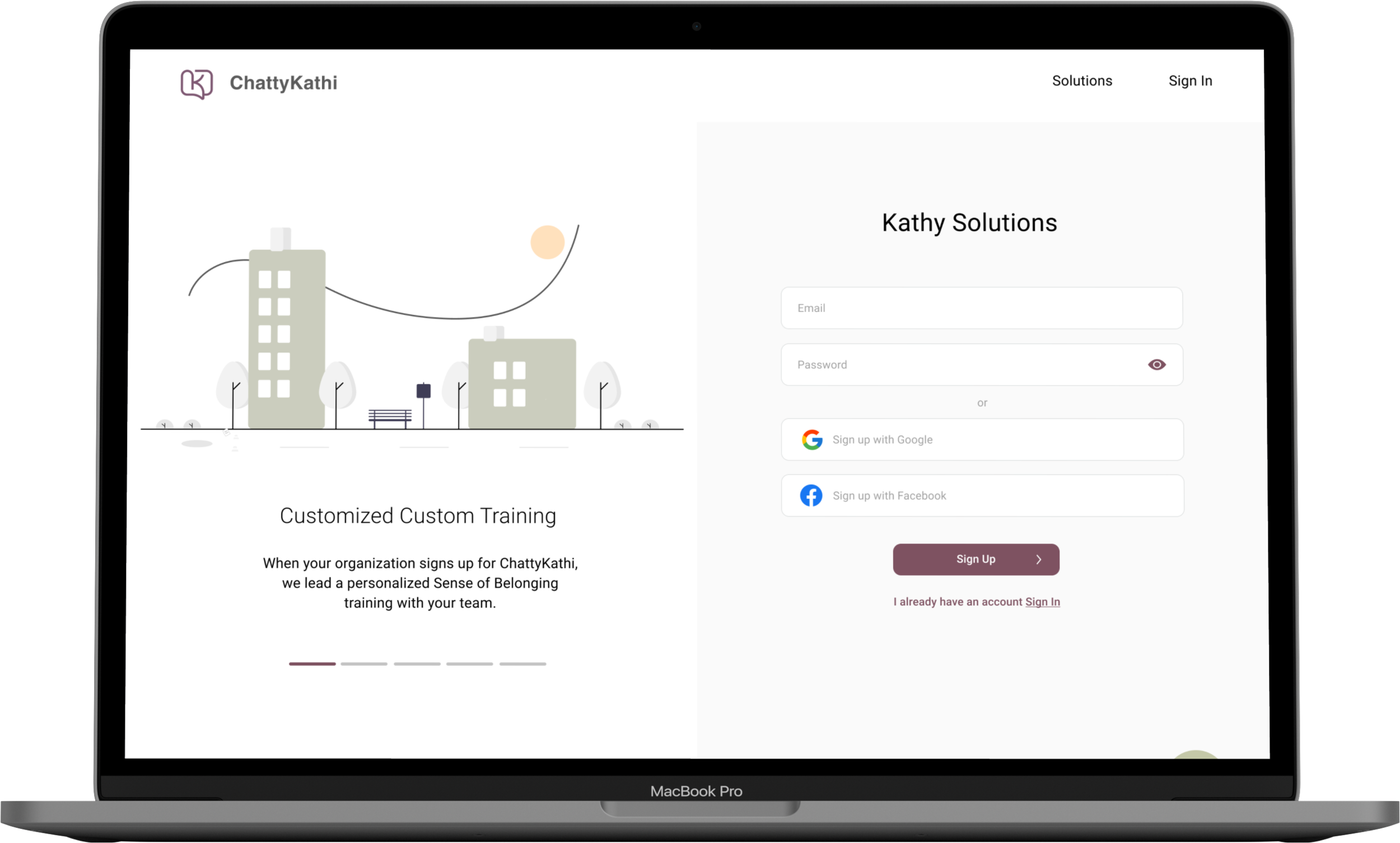
ChattyKathi, an SMS-based social platform, wants to redesign their admin portal that puts people before the technology — not the other way around, and we designed a solution for that.
Overview
Client
ChattyKathi
My Role
Lead visual designer. Co-Lead UX Designer, Researcher, Prototype.
Platforms
Desktop Portal
Tools
Figma, Miro, Google Forms, Trello
Duration
3 weeks
Team
2
THE CHALLENGE
How many of us have ever felt left out at school or work? ChattyKathi helps curate chats straight into small groups of no more than ten, right into your SMS. By having your community whether it be a school groups or cohorts talk often, people feel like they can rely on one another, they can provide spaces where they can be vulnerable, people can see different sides of them, they can have fun - discuss things other than work or school often, and support each other and not be competitive because this can create animosity.
ChattyKathi’s goal is to bring this platform into higher education systems to help foster a sense of belonging among students.
So what was our task?
ChattyKathi already has a great idea going. But how would the school administrator start getting these groups chatting? They had an admin portal, but it needed a redesign.
We were tasked with redesigning the Admin Portal, basically how the admin would add members, and create chats.
PROBLEMS
We decided to hit the ground running with usability testing the current portal. We were able to usability test 3 student specialists, which led us in the direction of our redesign. Our user research team identified 3 primary problems with the old portal. User feedback showed that the current portal needs additional solutions beyond adding and creating chats.
1. Dated.
User feedback showed that the current portal looked visually dated and out of touch with modern website design. The portal lacks visual tools for new users to familiarize key features.
2. Cluttered
Users felt that the current portal was cluttered and overwhelming, especially when it comes to creating chats, adding members, and scheduling chats. Key information is scattered throughout the portal.
3. Unsupported
User feedback showed that the onboarding process was not informative. They desired to learn more about the portal as they onboard.
RESEARCH UNDER LIMITATIONS
There was nothing like ChattyKathi
We did a Competitive and Comparative analysis, but where would we begin? The tricky thing was that there was nothing really like ChattyKathi: Would we look at portals? Would we look at Icebreaker chat-apps? What about team apps? The answer was a little bit of everything in order to get something close.
GroupMe works as an app but also organizes groups through SMS, and they had great simple organization.
Slack was another giant that was great for their great organization of groups and administration and easy guidance through their onboarding.
Kaapi is an icebreaker chat that gets groups to bond together, similar to ChattyKathi they also curate chats.
Donut is also an icebreaker chat that works to bring groups together, but works within Slack.
These were all great as far as creating groups and having a simple way for people to organize those groups. But they weren’t necessarily admin portals.
DEFINING OUR INSIGHTS
Opportunity
How might we make ChattyKathi’s admin portal modern, relevant, and supported?
Goals
We converted our 3 key problems into opportunities to solve for during the redesign.
Dated to Modern
The user interface of the redesigned portal should be visually appealing, refreshed, and use the new ChattyKathi portal design system. Additionally, the new portal should include tools to guide new users.
Cluttered to Relevant
The redesigned portal should have a dashboard displaying key features such as adding members, creating chats, scheduling chats easier to find and navigate.
Unsupported to Supported
The new portal should have informative onboarding to introduce users to key features and tool kits.
IDEATING SOLUTIONS

Designing the right thing
Early Concept
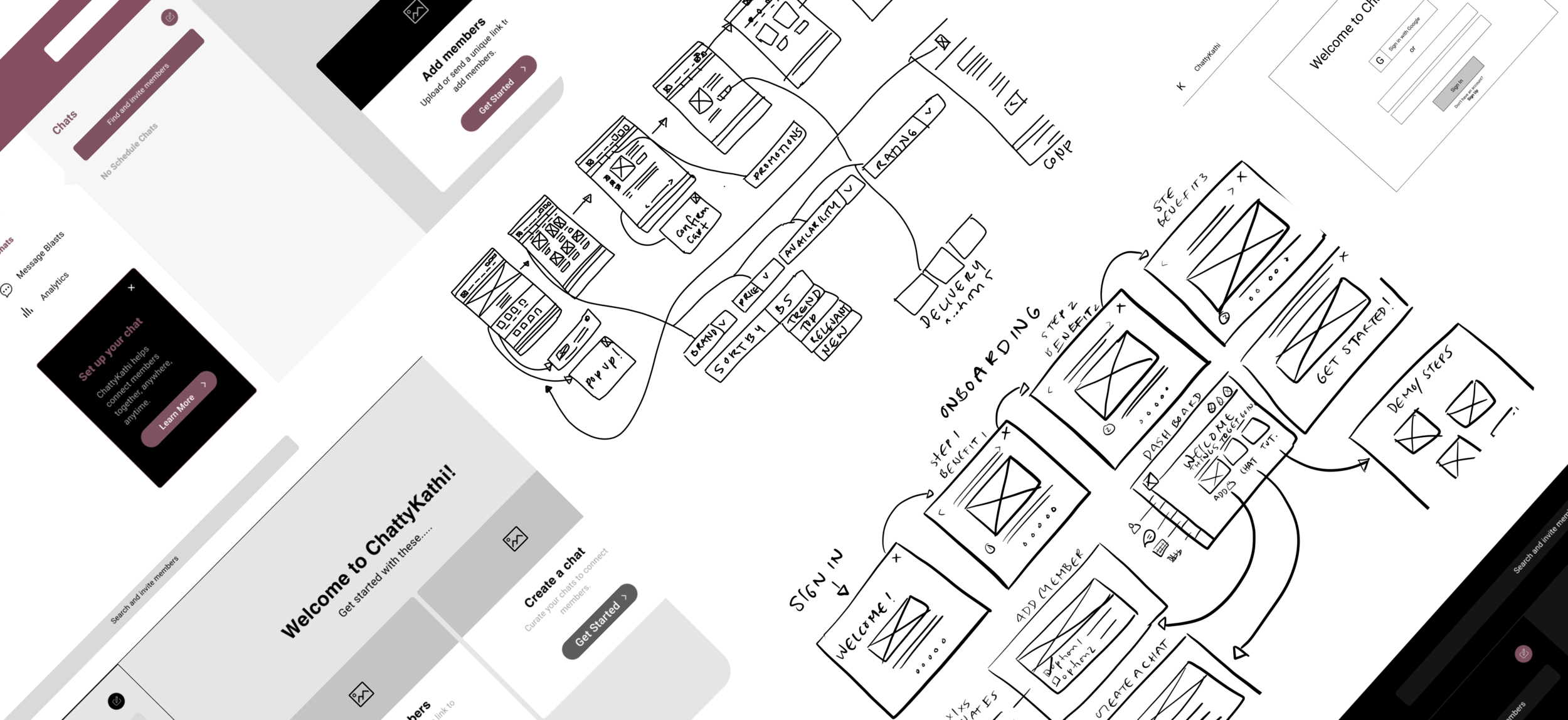
After deliberation, we realized that we need a dashboard: A way for administrators to have a clear overview of what was happening at all times with their members, chats, and interest libraries, and message blasts. We wanted the dashboard to be simple that prompts users with their main task. We started out with 4 main tasks but decided on only displaying 2 tasks because it better fits the solution.
Dark Mode
We got a lot of inspiration from some dark mode portals and started playing with dark mode but we decided to go with the light mode because it fits better with the business needs.
Light Mode
After reflecting on user needs and business goals, displaying 2 main tasks was a better fit for our solution. Even though we got inspired from dark mode, light mode better fits with the business and user needs.
The importance of organization and merging old and new
As we started to design our solution, we used the guidelines we discovered during the research phase. We reflected on existing information architecture from the current portal to optimize our reorganization and redesign.
We concentrated on the order of content or information architecture. That should be displayed on the dashboard? How would this impact the retention and interaction? We chose to display 2 main tasks (adding members and creating chats) on the dashboard and be visible in multiple sections for transparency.
During our interviews, we noticed users showed preference in having the options to create chats first . We assume this would help retain users' engagement and meet user needs.
Original site map
New site map
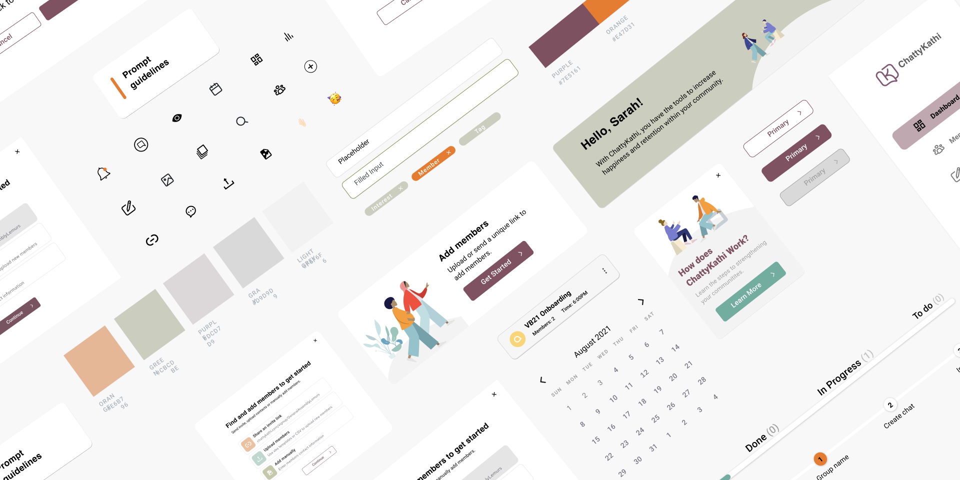
ChattyKathi DESIGN SYSTEM
The redesign of the admin portal was based on the backbone of the new design system. The new design system was built specifically for the portal which ensures that the portal maintains its look and feel.

CLARITY AND FEEDBACK=TRUST
After determining our solutions, we tested our hi-fidelity. During this stage, we tested 3 participants. During our usability testing, we made discoveries regarding accessibility issues and showed us that we need to make some iterations to our initial designs.
3 out of 3 users preferred to have the option to set chat durations. We added the option to add in the chat’s start and end date for clarity and transparency.
1 out of 3 users preferred bigger buttons. We changed the button to be more bold and big to ensure clarity and accessibility.
3 out of 3 users were wondering about the start and end date of the chat group. We added group start and end dates to ensure clarity of the group’s duration.
2 out of 3 users shared that the intro text is too lengthy. We decided to break the intro text section into 2 sections where users have the option to customize intro text or create their own intro text.
2 out of 3 users were confused about the hierarchy of groups and chats. To alleviate this problem, we linked the group to the chat bar. This allows users to see their groups and their corresponding chats.
2 out of 3 users were also confused about today’s scheduled text. To combat this confusion, we changed the wording to “Today’s outgoing text.”
Portal user testing results
Besides the improvement we need to make to our design, the portal received many positive feedback from users.
A Modern Portal
“Clean dashboard, visually pleasing. Colors are muted enough but still feel warm and inviting. It’s the exact feeling you would want to have for this platform and believe me, I’ve seen a lot of not so pretty dashboard.”
Not Cluttered
“There is a lot of breadth between different functions. Especially with apps like Slack, it feels so crowded and condensed so having space.”
Supportive
“A tool like this is very helpful in my role because we have so many different communication platforms that we use and they often get confusing. Also students are inundated with a lot of different communication methods, so having something like this enables us to have everything in one place. It flows very nicely and the functionality is very good.”
Final prototype
NEXT STEPS
A big pain point we learned from the usability testing was that the student specialists wanted to upload members with a link - but how would they be able to input students and then sort them into chats by those interests without being a tedious process?
We decided it would be useful to create a Student form, where they would receive a link from their administrator through a welcome email, then would easily sign up for ChattyKathi, input three interests, and once submitted those interests would populate in the administrator’s dashboard. These could potentially be presorted into those chats making even that much easier to the most important part: getting students chatting and getting to know one another.
Furthermore, we would love to interview ChattyKathi clients, conduct more usability tests redesign Message Blasts, and Analytics, and add admins with different capabilities. There is still work needed to differentiate between group and chats, and toolbox tutorials in hover state.
Even though we designed an onboarding process for admin, there is a need for student onboarding mobile and desktop.
FINAL THOUGHTS
I loved working on this project because of its great meaning behind ChattyKathi. ChattyKathi allows users to spend more time in enjoyable and meaningful discussions with the people around them. It was really fun and meaningful digging deep into ChattyKathi’s journey of lowering barriers to connecting with people by pushing past the stale ‘how are you’ question and progressing conversations toward the good stuff more quickly.
As a student myself, I sometimes wished there is a tool like ChattyKathi to bring students together before they even met in person. I learned the psychology behind friendship and the correlation between community and performance. For instance, when students don’t feel like they belong it’s very difficult to help them achieve their goals and be happy, and can cause depression and anxiety.
Additionally, this was my first client project and I gained valuable insights through working collaboratively with talented teams and grew stronger as a designer through feedback from knowledgeable stakeholders. Making ChattyKathi feel so accessible is deliberate. We wanted to build a social connection tool that put people before the technology — not the other way around.


