
Davidson Fine art

E-COMMERCE
ux/ui DESIGNER
CONCEPT PROJECT
overview
PROBLEM
The highest priority has always been given to the face-to-face contact we have with our customers. Although, in our current times, this has been difficult. We see an opportunity to support the local community by allowing people to order some products online. We built our website but we’re not pleased with the results. Through an improved website, including e-commerce, we want to showcase our products
my role
This was a solo concept project where I followed the double diamond approach. I completed all UX Research, UX Design, and Hi-Fidelity UI
Duration
2 weeks
solution
A clickable mid-fidelity and high fidelity prototype in Figma including the homepage, product category/detail pages, cart and checkout pages, and promotions. The solution allows for:
Expertise and recommendations establish brand trust online, which replicates the experience in-store.
DFA can expand their business to existing and new customers online, whilst still maintaining their local brand image and values.
THE CHALLENGE
client
DFA is the oldest and last remaining art store in Downtown St. Pete, FL. Rob Davidson founded the art store intending to provide local art supplies and vintage goods to locals. Proud to provide 100% satisfaction guaranteed. They are the only art supply store in downtown St Pete. They have the best pricing on quality canvas. Services include Framing, Printing, Vintage goods, Art supplies, and Artists collaboration. Specialized services include Print originals arts (collabs with artists), Vintage posters & photos, Rock & Roll, Concert posters, Historic St. Pete BW photos, and Events.


.


Business Goals
Davidson Fine Art needs a way to stand out as a local art store with an e-commerce site to meet the needs of careful critics who take a long time making their purchase decision to make sure they are getting quality art supplies.
THE OPPORTUNITY
Browse and buy art supplies online
See the store’s art supply inventory
THE PROCESS
1 2 3 4
DISCOVER define DEVELOP DELIVER
Persona User Flow Style Guide
User Journey Map Rough Sketches Final Design
Problem Statement Wireframes Next Steps
Site Map Usability Testing
Iterations
Mobile Wireframes
C & C Analysis
Task Analysis
Inventory Analysis
Card Sorting
Discover
COMPETITIVE & COMPARATIVE ANALYSIS
We conducted a business analysis of DFA and their existing competitors in e-commerce platforms and their future competitors to pinpoint needs and gaps.


Our competitor analysis highlighted the following:
There was a clear lack of e-commerce focus. All of DFA’s direct competitors were offering this.
All competitors offer online art supply stores.
Hypothesis
My hypothesis is that there is an opportunity to fill this gap. We wanted to ensure our designs emphasize the e-commerce focus for DFA. This also came up in our target audience needs, where users are looking to purchase online, but are looking to purchase quality supplies.
CARD SORTING
To help organize and understand how users view the current inventories, I conducted a closed card sorting with 5 individuals. Each individual was given 30 minutes to sort items in this table. In the end, I combined all results into this master table with the highest vote highlighted in green.


I then combined the results and did a master card sorting at the end. In addition, I also completed a complete makeover of the current site inventories.

DEFINE
UNDERSTANDING OUR USERS
From our research, we created our Persona, Amy.

PROBLEM STATEMENT
Davidson Fine Art needs a way to stand out as a local art store with an e-commerce site to meet the needs of careful critics like Amy who takes a long time making her purchase decision to make sure she is getting quality art supplies.
How might we’s
I developed two How Might We statements to find design opportunities:
How might we make online shopping an engaging and user-friendly experience?
How might we help Amy find quality art supplies?
How might we help DFA reach their e-commerce goal yet maintain the “local” branding?
USER JOURNEY MAP
To better understand Amy’s current approach to buying art supplies online, we made a user journey map to understand how she may go about purchasing.
Amy wastes time trying to find the specific information he requires to learn.
She struggles with the existing resources on the site.
The information available really doesn’t guide her purchasing process, and her interest in purchasing comes to a halt.

MY HYPOTHESIS
I believe that by simplifying online purchases for Amy, we provide her with an approach to her specific needs and we can help her find items through ratings and reviews so she can find what she needs. We will know this to be true when she is successfully able to conduct online purchases and check out.
DEVELOP
USER FLOW
A user flow helped me understand Amy’s new journey and structure what screens I needed to sketch out for my prototype. I set out two scenarios:
Amy needs to purchase a new art supply for her next art project and be able to check out successfully.
He also needs to be able to navigate back to the home page after purchasing.

DESIGNING BASED ON USER TESTING, ITERATIONS, AND USER INSIGHTS
Rough Sketches
Using Amy’s buying journey as a guide, I begin by doing rough sketches. Starting with paper sketches, I iterated to mid-fidelity wireframes and ended with my high-fidelity prototype. This involved lots of iterations based on feedback and user insights.


Wireframes Before Usability Testing


USABILITY TEST
I tested my designs with 3 users and iterated through 1 more round according to their feedback . Users were given two tasks within 5 minutes.
Users were given the following two tasks:
Create a task: Check out a set of 12 graphic pencils
Complete a task: Navigate back to the home page

To help me organize the feedback, I then affinity-mapped them to find trends and themes. Each color card corresponds to one user.

Using the feedback from usability testing, some of the key improvements from this iteration phase were:
Simplified content: We stripped down the screens, and reworded any confusing terminology.
Add buttons: I added the exit button to the pop up on the home screen, return to the cart, and view the cart
Added some needed context and clarification: I also included more information in confirmation stages of the purchase, e.g. return to home, and including the option for the user to see the purchase
Wireframes Before Usability Testing with edits


HIGH FIDELITY PROTOTYPE DEMO
DELIVER
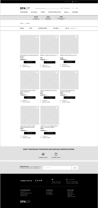
FINAL DESIGN
The final design can be seen in the Figma Prototype above or below.
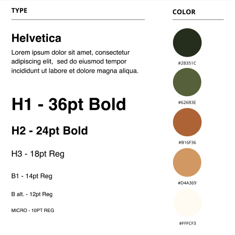
sTYLE GUIDE
It was important for DFA to have a new look and feel of the new website so I created a style guide for the solution to maintain its new look. the color pallet I chose resemble the flag of St. Pete to help distinguish DFA as a local store from their competitors.

St. Pete’s flag
Site map
I took a step further to reorganize all services provided by DFA to provide a cohesive and well-organized menu. This will allow DFA to pivot their strengths in specialized services and for users to find what they need easily.


moBILE WIREFRAMES
Looking ahead, I designed several frames from desktop to mobile.


SO, HOW DOES THE PROTOTYPE TACKLE AMY AND DFA’S NEEDS?
Users can browse and select items from the homepage, with the new e-commerce seamlessly integrated into DFA’s website. Additions to the navigation and having a new menu allows users to access them easily.
Users then can continue on their journey by checking the item’s availability and directly purchasing on the website. They can compare reviews from previous users and buyers, establishing trust and transparency of the product.
Finally, users can select a mode of delivery through the platform itself, reducing the worries of safety and not getting their items on time and
DFA will be able to expand their business to existing and new customers online, plugging a gap in the market for e-commerce, whilst still maintaining their established local brand image in the industry and community
NEXT STEPS
Mobile
Desktop
Complete wireframes for the user flow
Complete prototyping
Conduct additional comparative analysis
Work on UI
Complete hi-fi mockup
Work on overflow prototype
Conduct usability testing
Additional photos
Create additional wireframes
Complete prototype
Create additional pages
Create pre-fill forms
Work on UI
Additional card sorting
Additional usability testing
Additional rough sketches
Additional C & C analysis
Complete hi-fi mockup
Final Thoughts
As for my first e-commerce project at General Assembly, it was a great learning experience to balance applying new UX skills, whilst working to learn new skills as I go on with my project. I enjoyed seeing the groundwork of user research, working through the UX design process from discovery and research, synthesizing research and design strategy to placement, layout design, and then to prototype and usability testing have helped me to grow as someone who is a student who’s applying my knowledge to a project. I learned the importance of rough sketches as it allows me to communicate effectively, quickly, and effectively and then solidifying those to more refined digital prototypes.
I found it valuable to have a growth mindset and have that open and honest conversation about where we were doing great and where I could improve. These steps made a huge difference to the second week of the project, and I was able to make the most of my time for the project.